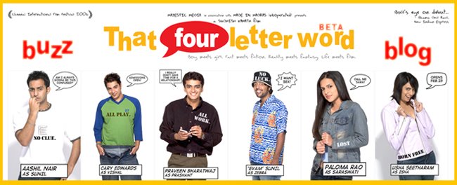
When a filmmaker makes a movie, there are parts he spoonfeeds and underlines, just to make sure the audience gets it.
A movie is a movie at the end of the day, you watch it to entertain you.
And there are parts of the film, a filmmaker makes for himself and for those who love cinema.
Cinema, of course, is not always a part of the movie.
Usually, the more commercial it gets, the more it is manufactured for the lowest common denominator and sometimes, dumbing down happens at the expense of the cinema in the movie.
So when I made TFLW, there are parts I made for the lowest common denominator of my already niche target audience. The youth at the crossroads of life.
I had to throw in a few laughs to balance out the serious introspective content of the film. That Four Letter Word was not written as a comedy. It is a light-hearted feel good coming of age film. Those who walked in expecting that, did end up liking it. So it is indeed pleasing that the target audience has recieved it well.
We've had a phenomenal opening for an independent film. And the audience response in the theatres, especially during the climax, is reason to celebrate. It's working. And then, there are parts of the film we designed for who like their cinema. The types who analyse films and appreciate the finer aspects of filmmaking. That is the aspect that's largely gone unnoticed.
This post will just talk about some things we did with the film that many didn't notice. Susan came up with a fairly balanced review, but for the wordage skewing in favour of what's wrong with it. But it's also probably because my newspaper does not want to be seen promoting its own employee.
Since she brought it up, I think I must start with the secret behind the film’s colour scheme. No, it's not about Wohoo! See what we can do with digital technology! It's because the film needed that feel.
The film was designed as a bridge between life and film. (The tagline goes: Boy meets girl. Fact meets fiction. Reality meets fantasy. Life meets film). Everything one should know about the film is right there. ‘Boy meets girl’ is your typical romance genre.
It is ‘Fact meets fiction,’ for obvious reasons.
It's borrowed from life and exaggerated (hence the comic book technique to alienate and facilitate a willing suspension of disbelief and to establish right at the beginning that you are not going to know too much about these guys apart from what you need to know)
Reality meets fantasy is that journey the characters make from dreaming to actually going and getting it. This is based on real people alright, but is clearly not a docu-drama. It is all about elements borrowed from life meeting elements that happen only in film.
The film tries to build a bridge between dreams and reality, between the boy and the girl (we specifically leave her mysterious till the end so that anyone watching that movie from Sunil's shoes can fill in his dream girl in that blank we've created.)
So if you try to represent life, what are the techniques you would use cinematically? Hand-held camera, surely. What else? Hidden cameras (candid camera like we used for the car), CCTV (the voyueristic camera in Zebra's room, at the beach during the six minute scene)... Did you realise that CCTV footage is black n white?
When you try to represent film or what is larger than life, cinematically, you tend to use saturated colours to create a sense of alienation and manufacture willing suspension of disbelief.
What are the other colour schemes that films provide us? The immediate connect would be the black n white Chaplinsque feel. So when you build a bridge between dreams and reality, fact and fiction, life and film, you deem it fit to cinematically represent that bridge through a colour scheme that represents elements from both life and film. So the film tends from reality to fantasy, using another colour scheme associated with surrealism.
We chose blue to create that surreal feel and complete that palette that ranged from black n white of video (that represents life) to scratched black n white film (that represents film). At another level, films are about fulfilling your fantasies.
Most of us go to the movies to see the hero win, to see the boy get the girl, to see good triumph over evil because these things don't often happen in life.
We like the escape films provide from reality. In TFLW, the characters have the same problems you do (and hence the realistic texture and treatment when they are having their talk, the camera is voyeuristic and non-intrusive, like a surviellance camera) but the reason they go to the movies is for the gratification of their dream and the escape films provide us (and hence the larger than life texture and treatment towards the end of the film, the scratched black n white film and the comic interludes... the chase in the end) and the Super-imposed text in the end tying up everything that the film stands for.
That Four Letter Word: Life.
The text in the end roots it back to your reality, spells out how movies are different from life itself.
Our writer friend (I can't call the kid a critic, at least, not from that "review") from New Indian Express displays her intelligence and phenomenal talent by observing: "As Sudhish himself admits at the end of the film that these things did not happen to people in real life."
Her IQ clearly is a notch higher than someone else from her paper who reviewed 'The Inside Man' with a brilliant punchline, after raping the Spike Lee flick. Oh, the famous last words of that review went: "Who was the inside man anyway?" Sorry, I digress.
That Four Letter Word, Life, is always full of those moments. The real, the surreal and the larger than life. We carefully picked scenes that represented these elements and painted them with the colour code from our palette of black n white, blue sepia, colours, saturated colours, burnt out colours and scratched black n white film.
All romance movies are about boy getting girl. We used the classic coming of age setting for this love story/stories of the lead guys, created willing suspension of disbelief with the comic book feel and then went on the life-meets-film trip.
We knew not everyone would understand but this was only for those who liked the cinema in the movie.
We had to use this palette to be true to the spirit of our narrative. That's why this is independent cinema. We tell stories that we want to tell, in a way we want to tell and to an audience we want to talk to.
That's also how it differs from mainstream cinema that caters to a mass. That's also why this is a multiplex film, a niche film, intended for a specific audience.
The screenplay's depth and how much we wanted to tell you about the characters too, was by design. We didn't want to give them surnames because we didn't want to get into their ethnic backgrounds. We wanted to keep it as general and as global as possible and that's exactly why we use the additional comic book narrator. A comic book will tell you Superman flies with a blue cape sporting his underwear outside without bothering to tell you why he does so.
Because, it's a comic book and it shouldn't be taken seriously. The events were made to look random to give it that feel of life in itself. The drag race was to illustrate that Prashant has tried to talk to Vishal before but Vishal being the guy who lives by the moment, is more interested in the challenge the moment presented him with, rather than the one posed by life itself.
And we had to show Prashant make at least one attempt to talk to Vishal before that huge six minute conversation right in the middle of the film (the scene for introspection, as Sunil calls it, the scene that defines the film... that scene that IS what the whole film is about). Basically, if these guys have been friends all along, why didn't Prashant tell Vishal what he did during that scene in all these years that they had been friends? Because, Vishal wouldn’t listen, he would race or do something else that the moment had in store. The race was to establish that equation.
Vishal would always have an answer. He would just ask him to calm down and chill, like he did at the pool table.
Prashant is the voice of reason, the personification of mind. Vishal is all heart and just cannot relate to the way Prashant lives his life.
That's also why Prashant figures that what he has to tell Vishal, he can only tell by addressing Sunil. So when Prashant tells Sunil, he's not expecting a drama King like Sunil to listen, what he tells him is actually directed at Vishal. And Vishal understands that, which is why he shoots back at Prashant and talks in defence of Sunil.
The nuances are all there, maybe our critics aren’t equipped adequately to understand that cinema is all about the sub-text (What you don’t tell but show or insinuate). Every scene is there in the film for a reason.
We would've rewritten the script over a thousand times in five years before we shot this version. And hey, we're in the select club of filmmakers who actually use a bound script.
I urge these critics to watch the movie again [especially, since they didn't have to pay the first time around :)], with an open mind. What I mean by an open mind is: Don't go in trying to like the film or hate the film... just take it one scene at a time.
And kid, remember what Uncle Ben told Peter Parker: "With great power comes great responsibility."
Independent cinema needs an open mind. Not an empty head. Independent filmmakers, unlike other filmmakers, put in their own money to make their film, without the backing of corporates or sponsors or studios, out of their love and passion for cinema.
Like Kamal Hassan once told me, "If you don't give the first man the courage to do something different, why will another even try?"
I'm glad the film is working with the audience.
I also hope this will soon prove that: If I can make a movie, anyone can.
Subscribe to:
Post Comments (Atom)


No comments:
Post a Comment